It’s really interesting to watch how clients select their kitchen colour. Some people know instantly what colour they would like before the design process has started, others can be still deliberating until the tenth hour. As you can imagine we’re frequently asked what colour certain projects are online so a similar look can be achieved.
Sometimes a client wants to know the current colour trend while others prefer a safer, more timeless option. With this in mind we wanted to take a look at the top 5 Little Greene colours which have been used in the past year at The Main Company.
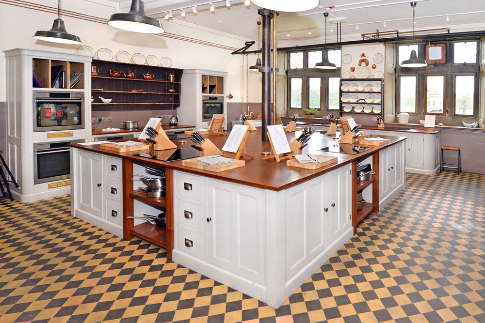
1. French Grey
With all our posts on social media and browsing online you may be shocked to know that French Grey is actually a firm favourite with many of our kitchens. Frey Grey is a staple if you’re looking for a timeless look. Often it’s been used to be neutral and subtle when clients have a two tone kitchen, using the island as pop of colour.
2. Lamp Black
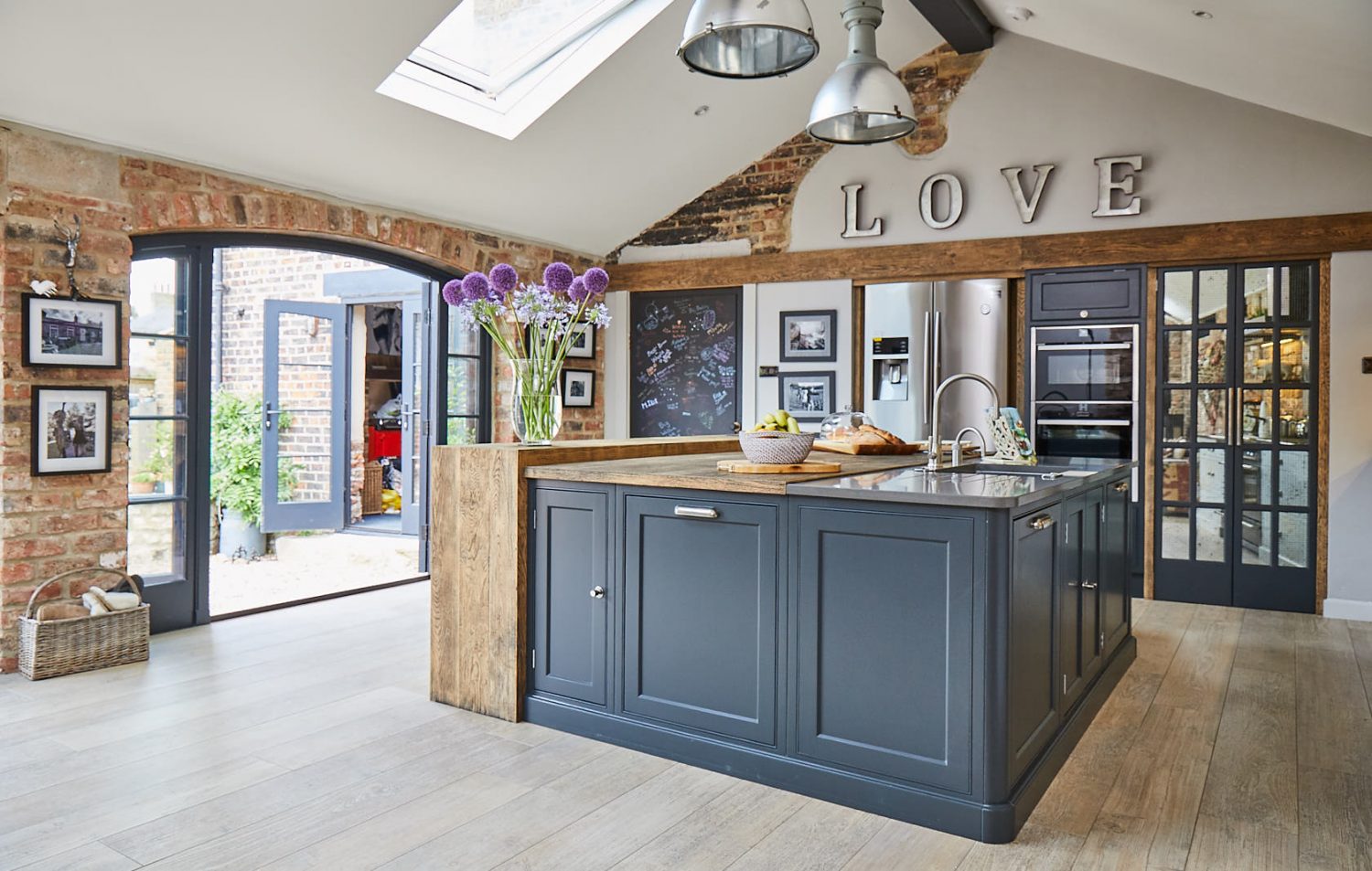
It’s no surprise that the kitchens most viewed on our website also are the most popular colour choices. Lamp Black has been used throughout numerous projects. It works so well for a variety of styles. You can see it in our industrial styled kitchens like Wighill and Berkshire, or highlighting certain units in the more Scandinavian kitchen, Cobham.
3. Basalt
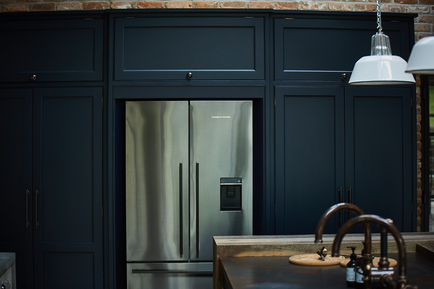
Like all colours, Basalt can change depending on the light of the room. A perfect example of this can be seen if you look at our Cornwall project vs Guildford project. In Cornwall, the colour feels to have a much more earthy and deep tone, whereas in Guildford it is a definite blue.
4. Hicks Blue
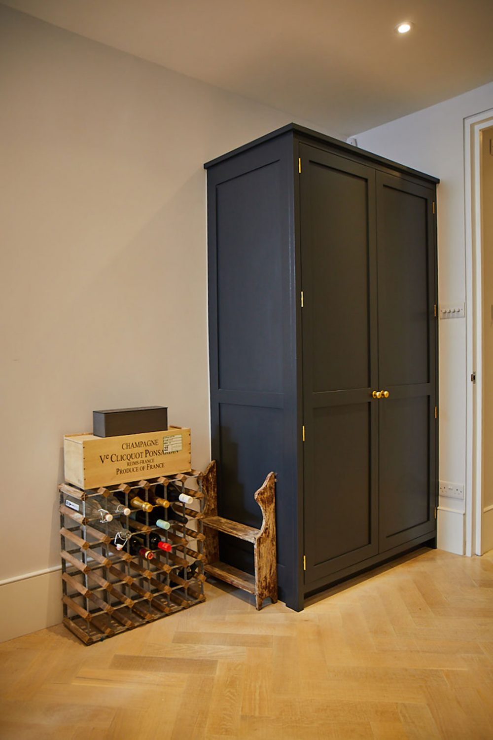
It is found not only kitchens, but we see Hicks Blue used a lot on our freestanding furniture pieces. Often clients already have a kitchen but need additional storage such as a larder. This gives a client the ability to inject some personality in to their kitchen. The deep inky blue colour of Hicks Blue is certainly the way to do it.
5. Tea With Florence
At last, but by no means least we have Tea With Florence. Little Greene launched their green colour card at Decorex International 2018, and ever since the increase in greens in the kitchen has been incredible. We’ve seen Three Farm Green used in the Barnes project and more recently Tea With Florence in our Essex Project.
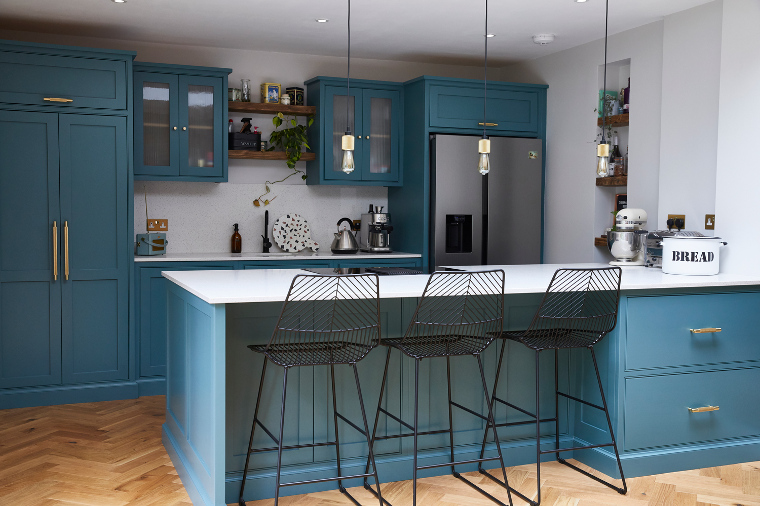
The number one thing we advise clients to do is get samples. A colour may look blue in our showroom but Grey in your home. Position a large board in the space and see how it looks at different times of the day. That way you’ll be confident the colour selected will work with the look you’re trying to achieve.
